The Company: Brand identity and brand expression system
Role: Design, creative direction
The Company is a dance crew based out of San Francisco, California. I felt honored to get to work with their founder Pat Cruz. Pat is also a member of the famous dance group The Kinjaz, who have been featured on MTV and NBC’s World of Dance—so it felt a little unreal that I was getting to work on this project. I started working with the team to create a brand expression system to help bring consistency to their promotional pieces. A lot of the promotional pieces they used lacked consistency and lacked a strong brand identity. When I first met with them, I learned a lot about how music, movement, and emotion were a big part of their team. I really wanted to learn as much as I could about the team to incorporate it into their design.
The Logo
Even though they didn’t want to redo their logo, I felt it was my due diligence to at least show them some options. I created a series of options and made some adjustments to their existing logo. Their logo at the time was created from the letter “T” intersecting a circle to form the letter “C.” The “T” and the “C” represented “The Company.” I modified the top bar of the “T” to better help form the shape of the letter “C” and make it look less like a wrench. They were really happy with the results and in the end they chose the modified version of the logo—even though they originally didn’t want to change it.
The Design
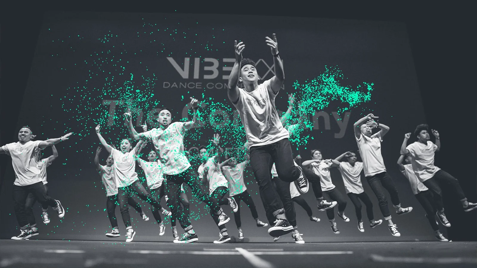
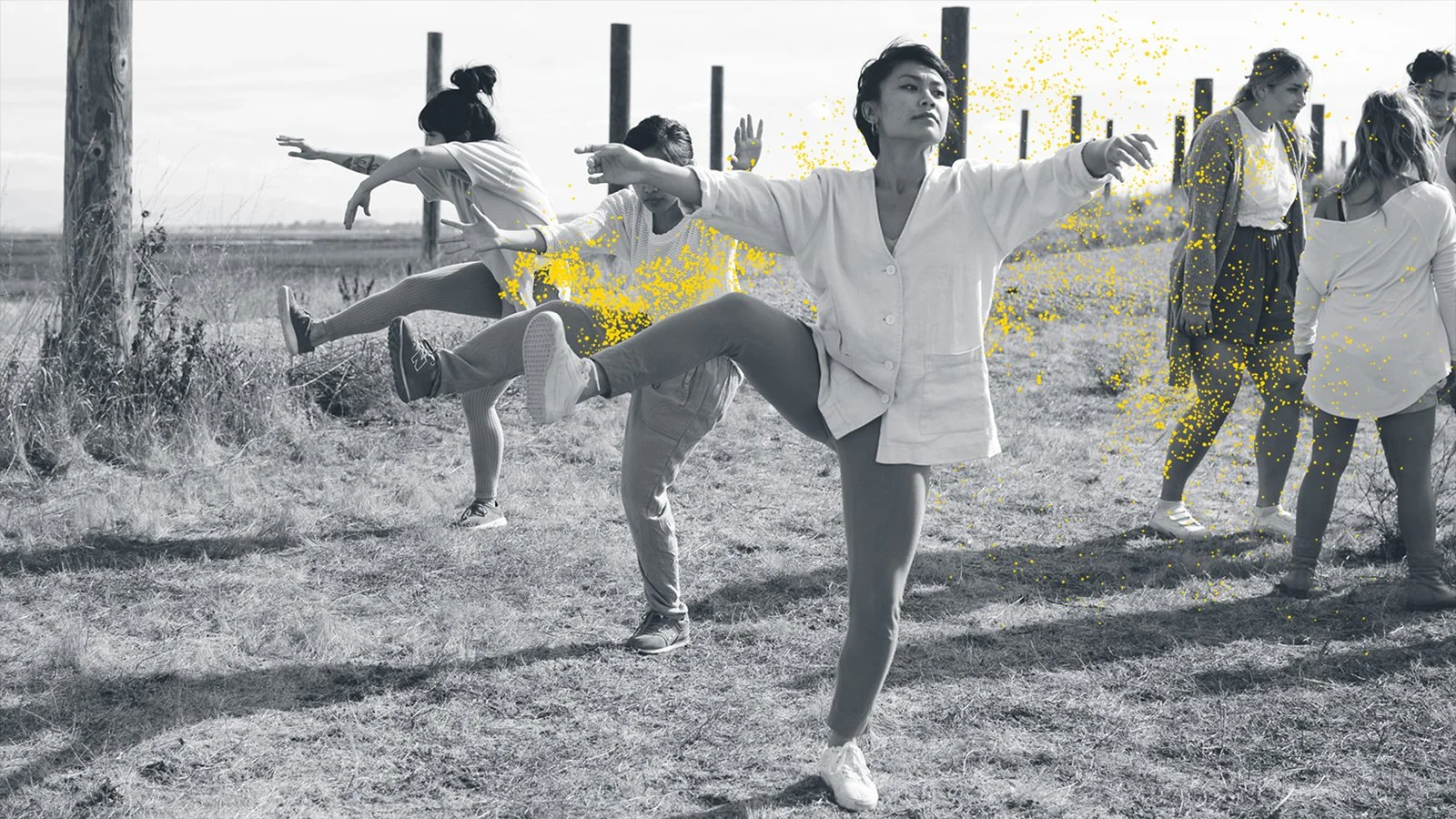
The team didn’t really have a design system, so I started to create concepts around meaningful elements to their team. The first concept played off of their logo mark. To add a dynamic element to it, I mixed dancers with the logo mark to appear as if they were coming out of it. The second concept was called musicality. In dance, music can be interpreted in so many ways. The way the team told stories through music and dance really made them unique. I developed a series of abstract lines to represent the staff—the horizontal lines you see on a music sheet. The last concept was called speak. The team used the term “speak” to represent emotion through dance. To represent this, I created visuals showing different design elements flowing from the dancers’ bodies. Even though the goal wasn’t to choose all of the design concepts, they ended up wanting to use all of them.


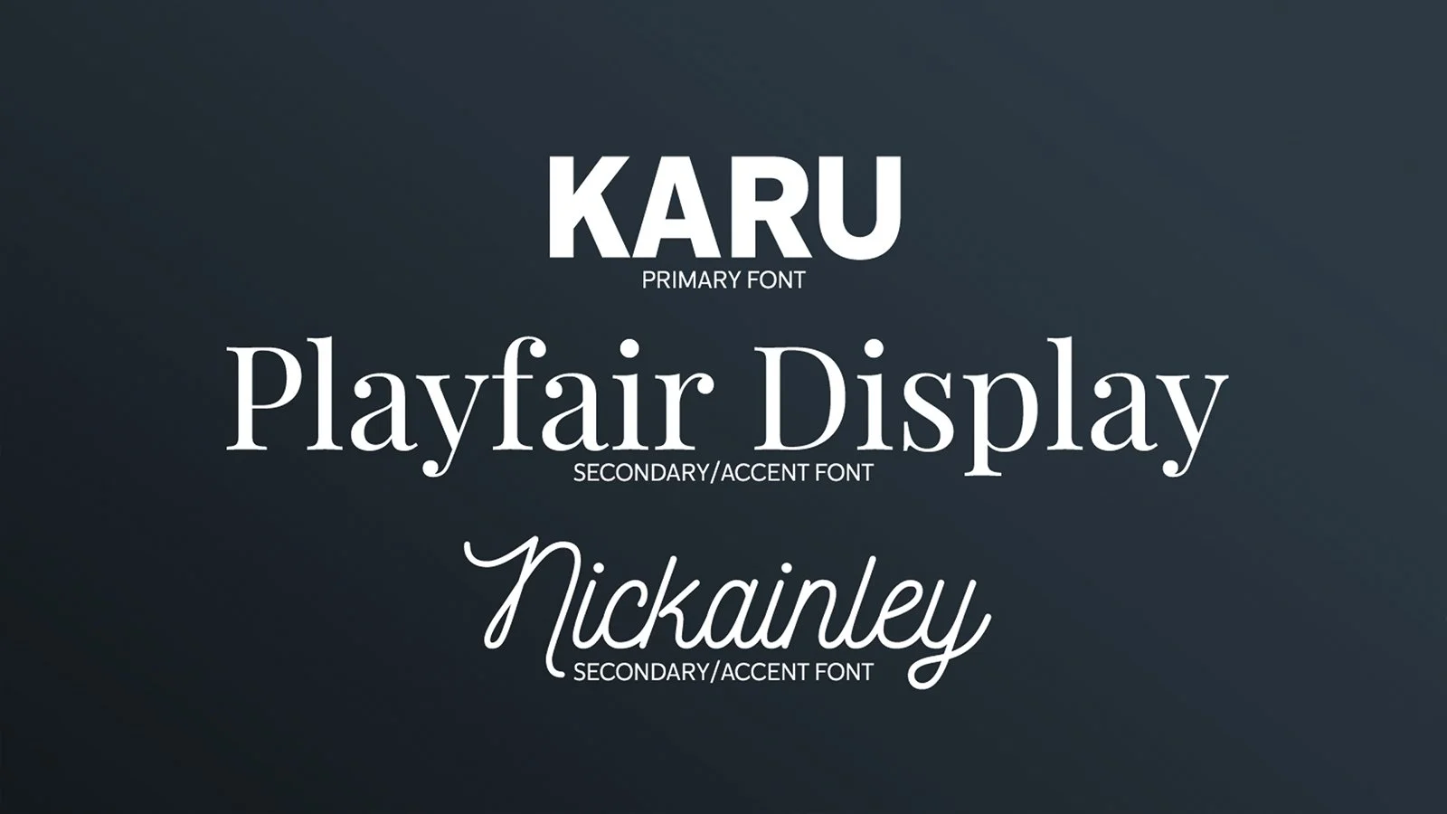
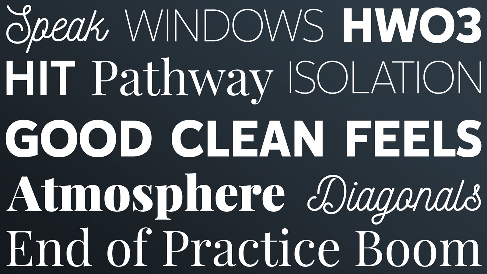
In addition to the design concepts, I showed them what the visuals could look like when applied to different applications. I also selected several fonts that I thought would work well for their identity.